Every high-converting digital experience starts with a vision. Whether you’ve crafted a clean UI kit in Figma, built creative brand collateral in Canva, or mapped an enterprise prototype in Adobe XD, your design is an intentional statement about your brand’s authority, credibility, and conversion intent.
Yet, for many small businesses and digital agencies, the most painful stage of the web development lifecycle is the handoff from design to live code:
Generic visual page builders
butcher the layout with mismatched margins, broken padding, and inconsistent typography hierarchies.
Bloated DOM trees
generate 3,500+ unnecessary elements, dragging down mobile load speeds.
Failing Core Web Vitals
on mobile devices frustrate prospective clients and trigger Google search rank penalties.
Inconsistent responsive behavior
causes desktop elegance to fall apart into a jumbled mess on smartphones and tablets.
A design mockup should never lose its polish during the transition to code.
We turn your vision into a pixel-perfect WordPress reality.
1. The Design-to-Development Chasm: Why Standard Conversions Fall Flat
┌────────────────────────────────────────────────────────┐
│             THE GENERIC BUILDER CONVERSION FAILURE     │
├────────────────────────────────────────────────────────┤
│ 1. VISUAL PAGE BUILDER WRAPPERS ► Deep DOM bloat (3k+) │
│ 2. UNOPTIMIZED CSS INJECTIONS   ► Render-blocking code │
│ 3. SLOPPY VIEWPORT BREAKPOINTS  ► Broken mobile UX     │
└───────────────────────────┬────────────────────────────┘
                            │  Compounding Friction & Rank Loss
                            ▼
┌────────────────────────────────────────────────────────┐
│             BESPOKE PIXEL-PERFECT ENGINEERING          │
│ Native Block Architecture • Sub-Second TTFB • Semantic │
└────────────────────────────────────────────────────────┘
2. Design Platforms We Translate into WordPress Architecture
No matter where your creative vision was born, our developers engineer an exact, accessible, and responsive translation.
A. Figma to WordPress (Design Systems & Auto-Layout Translation)
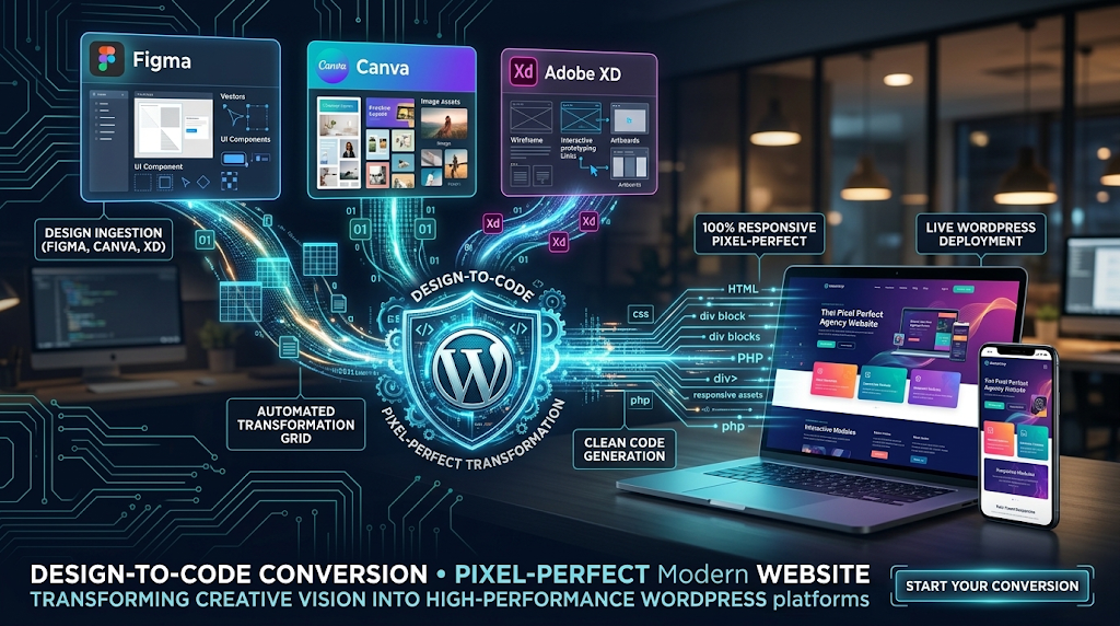
Figma is the gold standard for modern interface architecture. We extract your exact design tokens—color variables, typography scales, spacing grids, and component variants—and map them directly into a clean theme.json configuration and custom Gutenberg blocks. Every auto-layout frame translates cleanly into responsive CSS flexbox and grid modules.
B. Canva to WordPress (Fast-Tracking Small Business Launches)
Many growing small businesses and digital marketing teams create their visual brand guidelines, social assets, and landing page wireframes inside Canva. We take your Canva layouts, brand kits, and graphics, engineering them into structured, scalable WordPress web pages that maintain your brand's visual identity with zero layout compromises.
C. Adobe XD to WordPress (Interactive Prototypes to Functional Sites)
For agencies with extensive Adobe Creative Cloud workflows, we translate Adobe XD artboards and interactive component states into semantic HTML5, modern CSS, and lightweight JavaScript. Every micro-interaction, sticky navigation header, and hover state is built to perform smoothly across every viewport.
3. The 4-Step Engineering Blueprint: From File to Functional Platform
Our transition pipeline guarantees that visual design integrity is maintained alongside high performance:
┌────────────────────────────────────────────────────────┐
│          4-STAGE PIXEL-PERFECT CONVERSION PIPELINE     │
├────────────────────────────────────────────────────────┤
│ Stage 1: Token Extraction  ► Typography & Spacing Grids│
│ Stage 2: Semantic Markup   ► Native Block Architecture │
│ Stage 3: Viewport QA       ► Desktop, Tablet & Mobile  │
│ Stage 4: Performance Audit ► 90+ Mobile Core Web Vitals│
└────────────────────────────────────────────────────────┘
Design Token Auditing & Extraction:
We map your typography rules, exact hex palettes, margins, padding scales, and component behaviors into global style definitions.
Semantic Code Implementation:
We avoid heavy third-party page builders. Instead, we build using native WordPress Block Architecture (Full-Site Editing / FSE) or tailored custom hybrid themes, keeping DOM trees lean (under 800 nodes).
Multi-Viewport Fluid Responsiveness:
We test breakpoints across actual mobile, tablet, laptop, and ultra-wide desktop displays to ensure flexible fluid typography and zero horizontal scroll errors.
Core Web Vitals & Speed Hardening:
Before launch, assets are compressed to next-gen formats (AVIF/WebP), scripts are deferred, and styles are streamlined to guarantee green mobile PageSpeed benchmarks.
4. Code Architecture: Native Design Token Mapping via theme.json
JSON
{
  "$schema": "https://schemas.wp.org/trunk/theme.json",
  "version": 3,
  "settings": {
    "appearanceTools": true,
    "color": {
      "palette": [
        {
          "slug": "brand-primary",
          "color": "#0A66C2",
          "name": "Brand Primary Blue"
        },
        {
          "slug": "brand-dark",
          "color": "#111827",
          "name": "Brand Midnight Neutral"
        },
        {
          "slug": "surface-light",
          "color": "#F9FAFB",
          "name": "Clean Surface Light"
        }
      ]
    },
    "typography": {
      "fluid": true,
      "fontFamilies": [
        {
          "fontFamily": "'Inter', system-ui, sans-serif",
          "slug": "primary-sans",
          "name": "Primary Interface Sans"
        }
      ],
      "fontSizes": [
        {
          "slug": "hero-heading",
          "size": "clamp(2.25rem, 5vw + 1rem, 4rem)",
          "name": "Fluid Hero Heading"
        }
      ]
    },
    "layout": {
      "contentSize": "840px",
      "wideSize": "1280px"
    }
  }
}
5. Serving Small Businesses & Agencies Alike
- For Small Businesses: Get an enterprise-grade digital flagship that matches your exact brand vision, loads in milliseconds, and gives you an intuitive admin backend so you can edit content easily without breaking the layout.
- For Design Agencies: Eliminate the development bottleneck. Partner with a dedicated engineering team that honors your Figma files down to the exact pixel, delivers clean code on schedule, and lets you focus on high-value client design work.
Frequently Asked Questions
Bring Your Digital Vision to Life with WPDepartment
To understand the company behind these solutions, you can explore Staxtar’s official platform for more technical and business details.