
Yet, a massive performance disparity plagues commercial WordPress websites: a desktop PageSpeed score of 95 frequently collapses into a failing mobile score of 42.
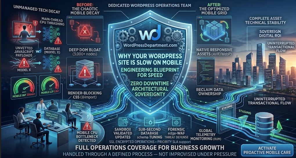
When a desktop user loads your website, they benefit from multi-core desktop CPUs, gigabit fiber connections, and massive RAM allocations. Mobile visitors, by contrast, navigate on mid-tier hardware under fluctuating 4G or 5G radio latencies.
If your platform makes their mobile browser execute 4 megabytes of unminified JavaScript, parse thousands of redundant CSS rules, and resolve 3,500 nested DOM nodes, the mobile CPU throttles. The screen freezes, layout shifts trigger accidental clicks, and your visitors bounce straight to your competitors.
1. The Mechanics of Mobile Latency: Desktop vs. Mobile Reality
┌────────────────────────────────────────────────────────┐
│           THE MOBILE PERFORMANCE BOTTLENECK            │
├────────────────────────────────────────────────────────┤
│ 1. HEAVY JS PAYLOADS       ► Main-thread CPU thrashing │
│ 2. EXCESSIVE DOM NODES     ► Massive layout reflows    │
│ 3. UNOPTIMIZED IMAGES      ► High network memory lock  │
│ 4. SERVER TTFB DELAY       ► Latency before first byte │
└───────────────────────────┬────────────────────────────┘
                            │  Compounding Mobile Decay
                            ▼
┌────────────────────────────────────────────────────────┐
│             FAILED CORE WEB VITALS (INP / LCP)         │
│ High Mobile Bounce • Dropped Google Rank • Lost Sales  │
└────────────────────────────────────────────────────────┘
When a mobile browser requests your URL, it must download, parse, compile, and execute every asset. On constrained mobile chipsets, JavaScript execution blocks the main thread. If a user taps a menu or an “Add to Cart” button while the thread is locked, nothing happens. Google penalizes this delay under the Interaction to Next Paint (INP) threshold.
2. The 5 Core Culprits Behind Mobile Sluggishness in WordPress
A. Bloated Visual Page Builders and Massive DOM Depth
B. Render-Blocking Third-Party Tracking Scripts
C. Heavy Desktop-Sized Media Assets
Serving a 2,500px wide, 800KB desktop hero image to a 390px mobile screen forces mobile hardware to download unnecessary data and resize image pixels on the fly, directly delaying Largest Contentful Paint (LCP).
D. Dynamic Server-Side TTFB Lag
E. Inefficient Font & CSS Delivery
3. The Engineering Blueprint: Step-by-Step Fixes for Mobile Speed
Step 1: Defer and Asynchronously Load Non-Critical JavaScript
PHP
<?php
/**
 * Automated Script Deferral for Mobile INP Optimization
 * Defers non-essential JavaScript to free up the mobile browser main thread.
 *
 * Engineered by WPDepartment.com
 */

if ( ! defined( 'ABSPATH' ) ) {
    exit;
}

add_filter( 'script_loader_tag', 'wpd_enforce_mobile_script_deferral', 10, 3 );

function wpd_enforce_mobile_script_deferral( string $tag, string $handle, string $src ): string {
    // Never defer core jQuery or administrative scripts
    $critical_whitelist = [ 'jquery', 'jquery-core', 'wp-polyfill' ];

    if ( is_admin() || in_array( $handle, $critical_whitelist, true ) ) {
        return $tag;
    }

    // Skip if script already has defer or async attributes
    if ( strpos( $tag, 'defer' ) !== false || strpos( $tag, 'async' ) !== false ) {
        return $tag;
    }

    // Apply defer attribute cleanly to non-blocking assets
    return str_replace( ' src=', ' defer="defer" src=', $tag );
}
Step 2: Implement Responsive Images with Next-Gen AVIF/WebP Formatting
<picture>
<source media="(max-width: 767px)" srcset="product-hero-mobile.avif" type="image/avif">
<source media="(min-width: 768px)" srcset="product-hero-desktop.avif" type="image/avif">
<img src="product-hero-desktop.jpg" alt="Optimized Product Experience" width="1200" height="630" fetchpriority="high">
</picture>
Step 3: Prune Unused CSS and Inline Critical CSS
- Extract Critical Path CSS: Isolate the styles required to render above-the-fold content and inline them directly into the documentu <head> sing <style> tags.
- Preload Style Delivery: Load secondary stylesheets asynchronously via rel=”preload” to prevent blocking the initial paint:
HTML
<link rel="preload" href="/wp-content/themes/custom-theme/css/non-critical.css" as="style" onload="this.onload=null;this.rel='stylesheet'">

<noscript><link rel="stylesheet" href="/wp-content/themes/custom-theme/css/non-critical.css"></noscript>
Step 4: Sub-Second Server-Side Caching & Database Schema Tuning
To get your mobile Time to First Byte (TTFB) under 200ms, optimize your origin server stack:
Deploy Redis or Memcached Object Caching
Cache repeated database queries in memory to avoid repeated lookups on every dynamic page load.
Edge Full-Page Caching via Cloudflare or Fastly
Serve completely cached static HTML copies of your public pages from edge data centers located close to your mobile visitors.
Prune MySQL Postmeta & Transients
Eliminate orphaned revisions, expired transient transients, and unindexed meta rows that slow down MySQL query lookups.
Step 5: Migrate to Native Block Architecture (Eliminating the DOM Bloat)
Frequently Asked Questions
Transform Your Mobile Conversion Velocity
To understand the company behind these solutions, you can explore Staxtar’s official platform for more technical and business details.